
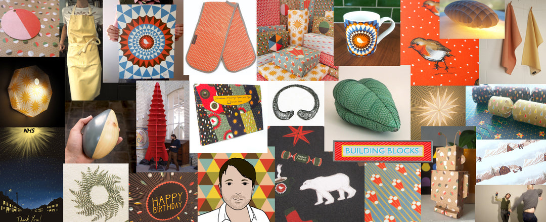
Building Blocks A New Creative Blog
Welcome to ‘Building Blocks,’ bright stem’s new creative blog! As I’ve written in the blogs description this will be a place for Art, Design and Craft. It’s going to be somewhere that reflects the kind of creativity I Love, I.e. not squeezed into any specific niech, just a place to show things I’ve made in whatever form they take.
As I’ve just finished working on the name and design for the blogs header image, I thought that would be a good place to start. The header image has been designed with two main things in mind. Firstly, to communicate that the blog is a place for all whether you’re a seasoned artist trying to find out about my creative process, a customer wanting a bit more detail on how the products where designed or a first-time crafter just searching for a bit of inspiration. Secondly, that it should be somewhere fun and engaging. I love creating new things and so the blog should exude that love. So that’s the brief; an accessible fun creative blog.

The name itself ‘Building Blocks’ has been repurposed from a body of research I started a few years ago into visual mind maps. It never really suited that purpose though. But when the idea for this blog came about, I realised it just fit. Almost as if it was saying finally, you’ve realised what I’m for! Its fun, playful and unpretentious expressing creativity at its most basic level.

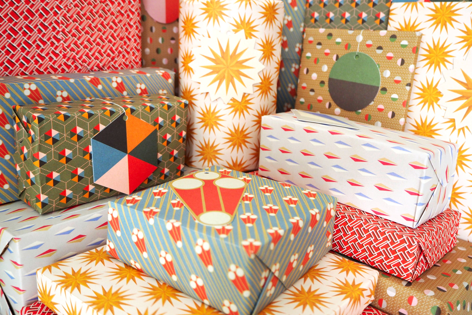
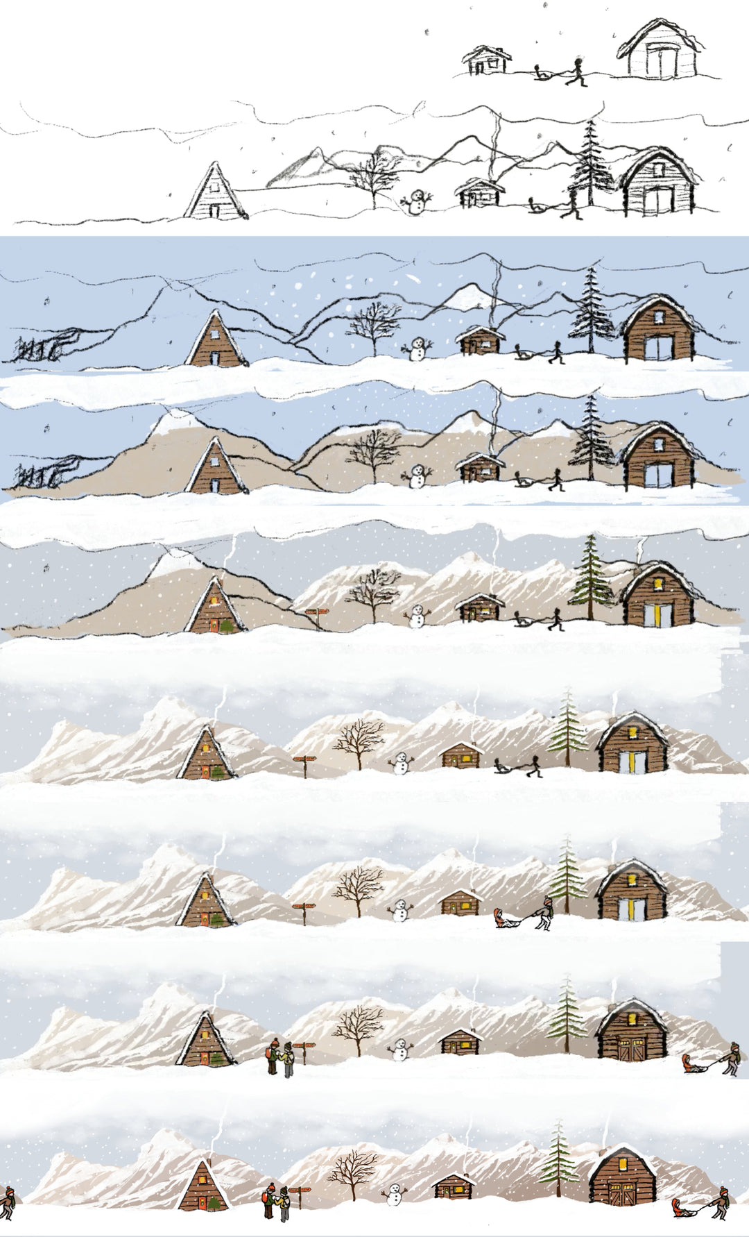
As soon as the name was decided it felt right to have the header image hand-drawn. Giving a more personal and handmade feel. However the layout and colour scheme needed to be designed first. Its much easier/quicker doing this as a vector graphic. Then to move across to illustrate the final artwork. That’s not always the case, sometimes the illustration comes first and the design/colour elements second. For example that’s how I created the Illustrated Christmas wrapping paper. It just depends what works best for the idea you’re working on.
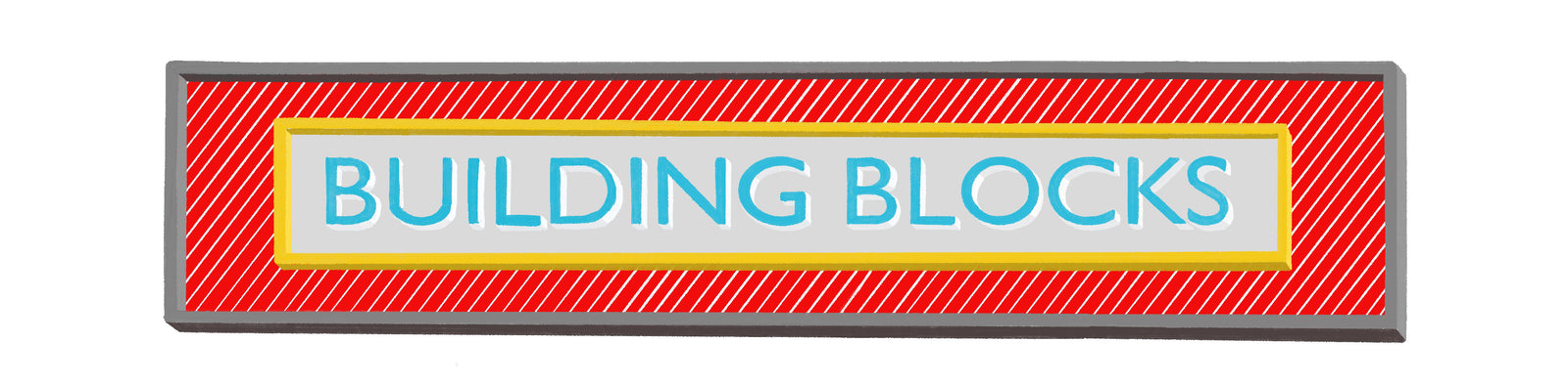
The design process started with the idea that the layout needed to be simple almost as if it hadn’t been over thought. So, I began by choosing a clean modern font on a solid bright yellow background to give a positive burst of colour. Then flirted with both green or orange but neither of them said this was a place for building things. I was initially unsure on the grey as I’d envisioned the design to be bright and colourful, but at the same time it brought to mind functional qualities of metal, concrete, tools etc. associated with building. This made me think grey might be important to incorporate.
The one-colour background now seemed a bit too simplified so I altered the design to become one box for the text contained within another made up of a simple repeating pattern. This combination of layers added more depth and just seemed to work.
Next I tried a red background with white stipes and grey but that was a bit intense like it was a danger sign. Realising at this point it needed to be a multicoloured design. Like something you might find on the packaging for a vintage construction kit (e.g Mechano or Lego). I chose a light blue for the text to combine with the grey, red, whites and a bit of yellow for a bit of bling which seemed to hit the spot.

Then came the final stage to illustrate the design. This was pretty straightforward I made some small tweaks to the layout and drew the text and border to give a three-dimensional feel. Importantly this also added some slight imperfections to the design, giving it the feel of a handmade sign that someone might make for their kid’s toy train set. I’m happy with the final design. It feels accessible, fun and full of love so hits the brief pretty well. Hope you all like it too and looking forward to getting some more posts up on here soon.
Leave a comment